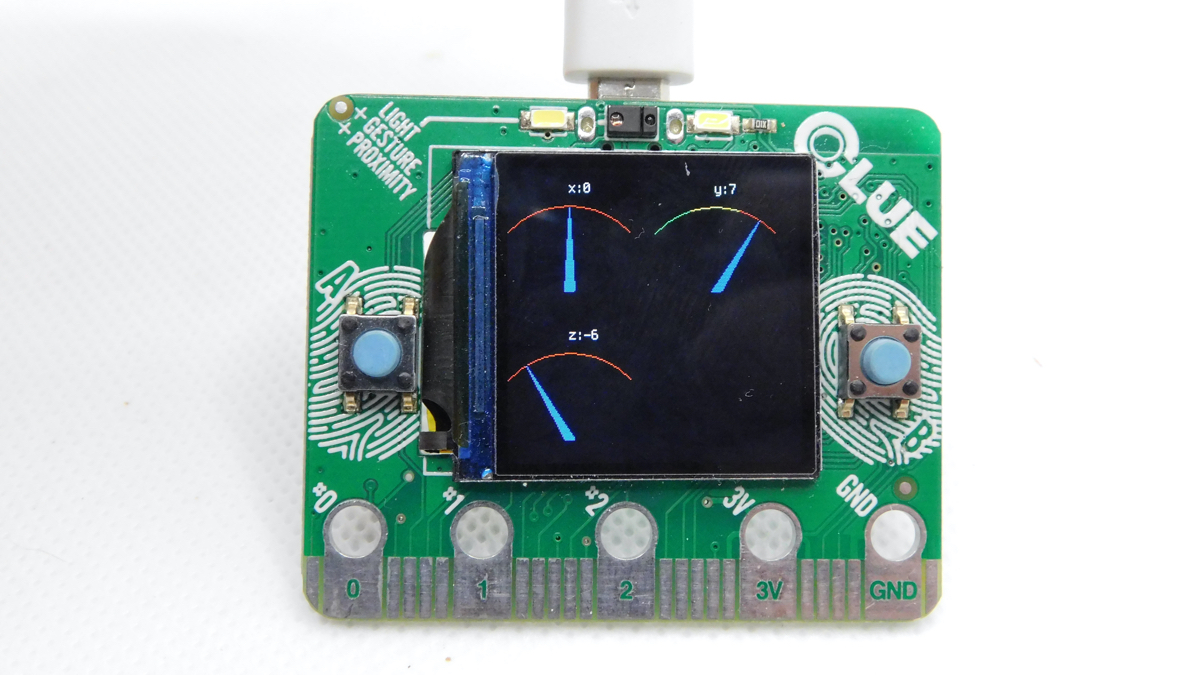
In the past year, the displayio library has seen a lot of development – so let’s take a look at how to draw graphics with this microcontroller. Back then, we looked at drawing bitmap graphics on the screen, so now let’s take a look at what it’s like drawing with primitives like triangles.
We’re going to take a look at a simple gauge that displays data a bit like a car speedometer. We’ve created a library to make this easy – so the basic way of using it is just to copy the gauge.py file from hsmag.cc/1fH3ZZ to the lib folder of your CircuitPython device.
You’ll need a screen to make this work. We’ve tested this out on both an Adafruit CLUE and a Pimoroni Enviro+ FeatherWing. The code we’ll look at here takes the accelerometer data from an Adafruit CLUE and displays it as gauges.
import board

from adafruit_clue import clue

import displayio

import time

from gauge import Gauge


display = board.DISPLAY


colour_fade=[
    0x00FF00,
    0x00FF00,
    0x00FF00,
    0xFFFF00,
    0xFFFF00,
    0xFFFF00,
    0xFFFF00,
    0xFF0000,
    0xFF0000,
    0xFF0000]


gauge = Gauge(-10,10, 120, 120, value_label=”x:”)

y_gauge = Gauge(-10,10, 120, 120, value_label=”y:”, arc_colour=colour_fade, colour_fade=True)


y_gauge.x = 120


group = displayio.Group(scale=1)


group.append(gauge)

group.append(y_gauge)


display.show(group)

board.DISPLAY.auto_refresh = True


while True:
    x, y, _ = clue.acceleration
    start = time.monotonic()
    gauge.update(x)
    y_gauge.update(y)
    print(time.monotonic()-start)
Gauges are displayio groups, so we can manipulate them as you would other groups, such as repositioning them by setting their x properties as we have done with the y_gauge here.
The full code is available on GitHub, but let’s take a closer look at gauge here. We add data using the update method which is:
    def update(self, val):
        max_angle = 135
        if val<self.min_val: angle = 45
        elif val> self.max_val: angle = max_angle
        else:
            angle = ((((val-self.min_val)/(self.max_val-self.min_val)))*(max_angle-45)+45)
        top_point_x = self.mid-int(math.cos(math.radians(angle))*self.length)
        top_point_y = int(math.sin(math.radians(angle))*self.length)

        if self.outline: self.arrow = Triangle(self.pivot1[0],self.height, self.pivot2[0], self.height, top_point_x, self.height-top_point_y, fill=self.colour, outline=self.outline_colour)
        else: self.arrow = Triangle(self.pivot1[0],self.height, self.pivot2[0], self.height, top_point_x, self.height-top_point_y, fill=self.colour)
        super().pop()
        super().append(self.arrow)

       self.data.text = self.value_label+str(int(val))
There’s quite a lot of maths here, but basically, a gauge works by having a line (or in this case a triangle) that goes between a pivot point and a point on the arc. The data is represented by the position on the arc the line hits. We calculate this and store it in the top_point_x and top_point_y variables. With these in place, we can create a new triangle (in the self.arrow variable) using the top point, and two corners that stay fixed. These represent the base of the indicator. This is a slightly cheating way of drawing it, and it will mean that the indicator is a little thinner when it leans to either side than it is when it’s in the middle, but in practice, this isn’t too noticeable.

Since our gauge is a subclass of group, we can use super().pop and super.append to remove and add items to the group.
As well as the indicator, we also draw an arc that shows the range that the indicating arrow can move in. This can either be one colour or a range of colours that indicate, for example, at what point the value being displayed should alarm the person using it.
At the time of writing, the displayio library doesn’t include the ability to draw lines, so we have to cheat a little and build our arc up out of triangles. If two corners of a triangle are the same, then we get a line. This isn’t the most efficient way of doing it, but it works.
All this is done in the draw_arc method, which returns a list of triangles that can be added to our group.
def draw_arc(centerpoint_x, centerpoint_y, length, start_x, end_x, num_sections, colour, height, colour_fade=False):
    triangles = []
    lastpoint = [start_x, int(math.sqrt(length*length-(centerpoint_x-start_x)*(centerpoint_x-start_x)))]
    increment = (end_x - start_x) / num_sections
    counter = 0

    for i in range(0,num_sections):
        if colour_fade: this_colour=colour[counter]
        else: this_colour = colour
        next_x = start_x + (i+1)*increment
        nextpoint = [int(next_x), int(math.sqrt(length*length - (centerpoint_x-next_x)*(centerpoint_x-next_x) ))]
        triangles.append(Triangle(lastpoint[0], height-lastpoint[1], lastpoint[0], height-lastpoint[1], nextpoint[0],height-nextpoint[1], outline=this_colour))
        lastpoint = nextpoint
        counter = counter+1

    return triangles
There’s a bit more code, but it only links everything together. Take a look at the GitHub project to see everything.
The speed our gauge runs at depends a lot on the size of it. We found that on a CLUE, we could get about 7fps with two gauges each 120 pixels across, which is plenty for most purposes (if your data’s displaying faster than this, a gauge may not be the most appropriate display anyway).


